
What is the best colour for kitchen countertops
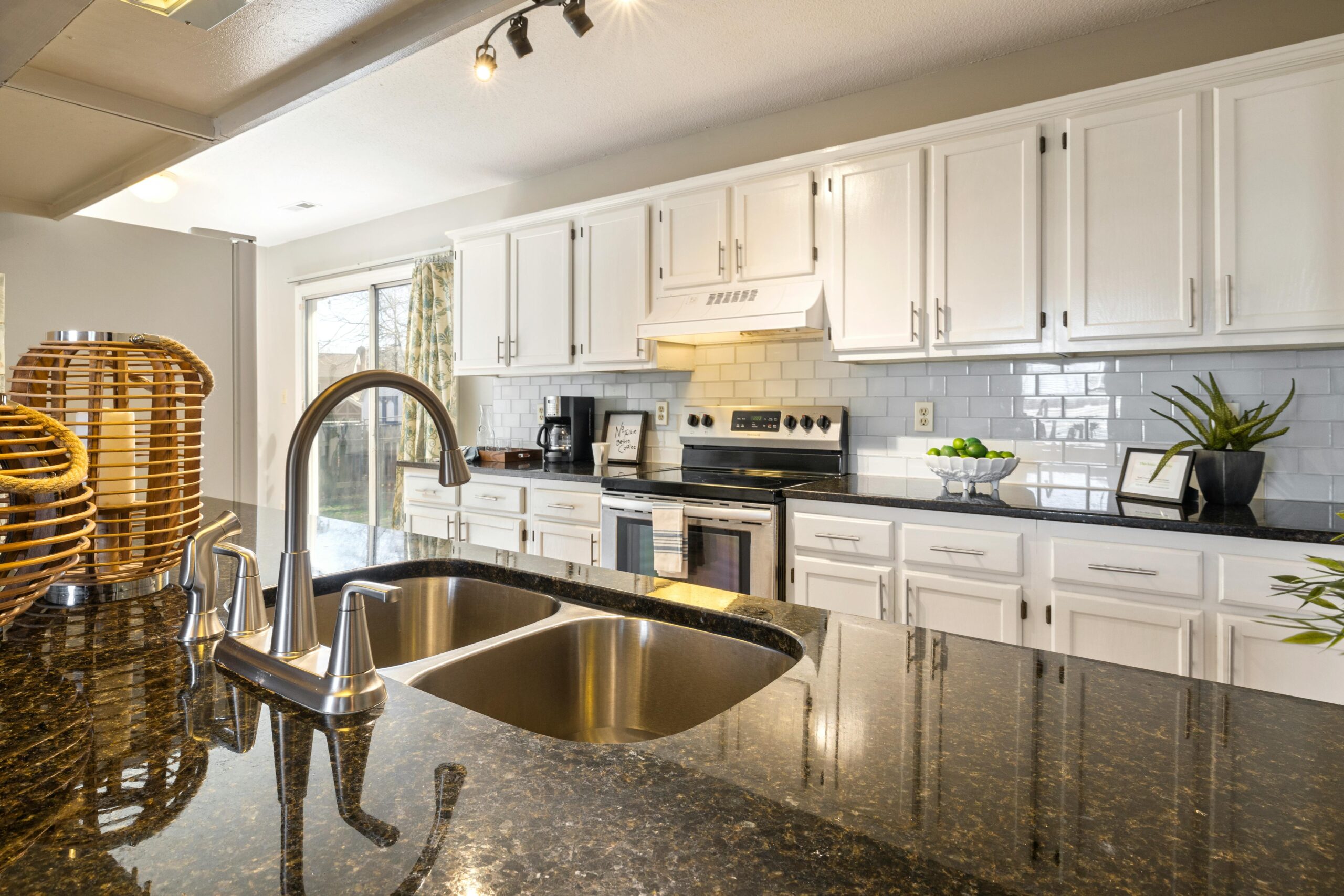
Choosing the color of a kitchen countertop is a significant decision that can greatly influence the overall design and ambiance of the kitchen. Personal style, functionality, and maintenance needs all play a part in deciding the most suitable color for a countertop. Tips for selecting kitchen countertop colors, including both natural and man-made materials, as well as suggestions on how to match the countertop color with the kitchen design, are provided in these sections.

Factors to Consider when Choosing Kitchen Countertop Colour
When selecting the colour of your kitchen countertop, it is one of the most important decisions that can impact the beauty and functionality of your food preparation area. Factors to consider include personal design preferences, durability, maintenance requirements, and how well it fits with the overall design of the kitchen space.
The colour of your kitchen countertop plays a significant role in the overall coherence and attractiveness of the space. Dark colours like charcoal or black can convey a sense of formality, while lighter colours such as white or beige can create a feeling of spaciousness and openness.
It is also important to consider the investment factor – is the colour a timeless hue or a trendy shade that may quickly go out of fashion? The best kitchen countertops will find a balance between personal preferences and practical considerations, ensuring your satisfaction with your choice in both the short and long term.
Personal Style and Design Aesthetic
The best kitchen countertop colour for you is one that complements your personal style and interior design preferences. Your choice of countertop colour should align with your overall design aesthetic to showcase your unique personal taste.
Selecting a countertop colour that resonates with your personal style can enhance the visual appeal and cohesion of your kitchen space. Whether you lean towards a modern and minimalist look with clean, monochromatic surfaces or favour an eclectic design with vibrant hues, the colour of your countertops can set the tone for the entire kitchen ambiance.
Colours have the power to evoke specific emotions – for instance, blues and greens are often associated with a calming effect, while reds or blacks can exude sophistication and drama. By integrating your preferred colour palette into your countertops, you can infuse your kitchen with a distinct and personalised touch.
Functionality and Maintenance
When selecting a colour for kitchen worktops, it is vital to consider both functionality and maintenance. The chosen colour should enhance the aesthetics of the kitchen while also offering practicality, durability, and ease of upkeep at a reasonable total cost of ownership. Opt for a colour that complements the overall kitchen decor and is resistant to stains, scratches, and heat. Additionally, prioritise selecting a colour that requires minimal maintenance, as this will not only enhance the kitchen’s appearance but also reduce stress for homeowners. A durable colour that demands little maintenance will ultimately save time and money by minimising the need for repairs or replacements. Therefore, it is crucial to take into account both functionality and maintenance when deciding on the colour for your kitchen worktop.
Popular Kitchen Countertop Colours
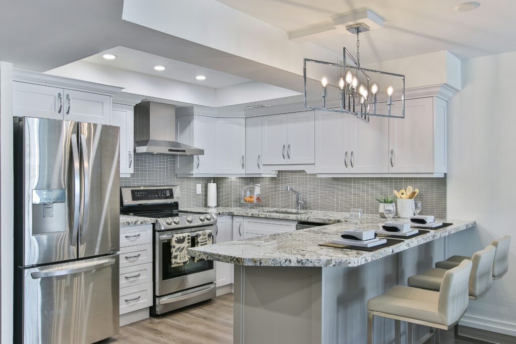
Discover the most popular kitchen worktop colours globally and the top choices among homeowners. These colours span from classic whites to modern blacks, catering to both modern and traditional kitchen designs.
White worktops exude a clean, timeless aesthetic, adding brightness and a sense of spaciousness to any kitchen. Black worktops, on the other hand, bring an elegant and sophisticated vibe, offering a striking contrast that can make a bold statement. Grey worktops provide a versatile neutral backdrop that complements various design styles.
These colours are versatile and easy to coordinate with different elements like cabinetry and splashbacks, allowing for the creation of a cohesive colour palette that reflects contemporary design trends throughout the entire kitchen.
Neutral Colours
White, black, and grey are the most popular colours for kitchen worktops. These neutral tones are versatile, offering a classic and timeless aesthetic that complements both modern and traditional kitchen designs.
The soothing and understated nature of neutral worktops allows for easy pairing with a variety of cupboard finishes, splashback options, and appliances. White worktops create a fresh and spacious feel, particularly enhancing the appearance of smaller kitchens, while black worktops exude a bold and sophisticated vibe.
Grey worktops are a popular choice as they strike a balance between the crispness of white and the boldness of black, resulting in a more subdued yet impactful look. Neutral-coloured worktops are enduring choices that effortlessly coordinate with any kitchen style, ensuring a timeless appeal that transcends passing trends.
Bold Colors
Opting for bold colours as a countertop choice can make a powerful statement for individuals looking to add a bold touch to their kitchen. These vivid colours infuse personality and style into the kitchen, adding a splash of colour. Vibrant hues like emerald green or deep blue introduce a level of energy and intrigue that neutral colours lack.
When paired with modern cabinetry or contrasting textures such as natural wood or marble, bold countertops become a dynamic focal point that completely transforms the room’s ambiance. Incorporating these vibrant colours enables the room to showcase a daring design choice and stay in line with current colour trends. By simply changing the wall paint and accessories, the kitchen can maintain a fresh and contemporary feel.
Patterns and Textures
Patterns and textures play a significant role in enhancing the character of kitchen worktops. Introducing various textures and patterns to kitchen worktops can visually elevate kitchen spaces. Popular patterns such as marble veining, granite flecks, wood grains, and other textured materials cater to a range of modern or traditional kitchen designs.
The selection of patterns and textures helps set the tone and atmosphere of a kitchen. For instance, marble worktops featuring bold veining can make a stylish statement in a contemporary kitchen, while a wood grain texture with softer, more subtle lines can add warmth and comfort to a rustic-themed kitchen.
By choosing appropriate textures, homeowners can harmonise different elements in their kitchen to create a cohesive and visually appealing space that truly represents their style and preferences.
Matching Countertop Colour to Kitchen Design
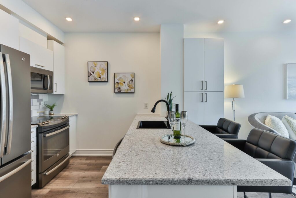
Properly coordinating the colour of the countertop with other kitchen design elements such as cabinets and flooring is crucial for achieving a cohesive aesthetic. Colour coordination plays a key role in bringing together the various components of a kitchen.
By selecting a countertop colour that shares undertones with the colours of your cabinets and/or flooring, you can create a cohesive look that exudes balance and harmony. For instance, if your cabinets feature warm wood tones, opting for a countertop with similar undertones can enhance the overall warmth of the space.
Introducing contrasting colours can also add visual interest, such as pairing a dark countertop with light cabinets to create a focal point. Striking the right balance between coordinating and contrasting colours will help you craft a kitchen that emanates warmth, natural beauty, and a sense of equilibrium.
Coordinating with Cabinets and Flooring
When choosing a worktop colour, the most important factor is coherence with the existing cupboards and flooring. This means that the colours of cupboards, floors, and worktops should complement each other to achieve a coherent overall aesthetic and design scheme. Considering the tones and undertones in the cupboards and flooring can help create a well-thought-out colour palette that enhances the design.
For instance, dark wood cupboards can be complemented by light worktops to create contrast while maintaining unity. Using different shades of the same colour can add depth and complexity to the colour scheme. The overall style of the kitchen, whether modern, traditional, or eclectic, should guide your decision to ensure a visually appealing and coherent result.
Creating a Cohesive Look
Creating a coherent look in your kitchen involves considering the relationship between the worktop colour and the colours of the cupboards, flooring, and overall design scheme. Proper coordination and harmony can result in a visually integrated and coherent space.
To achieve a harmonious design for your kitchen, opt for worktop colours that complement the other elements of the kitchen. For instance, you can choose a neutral worktop colour to balance bold cupboard colours or vice versa to introduce a splash of colour. Maintaining a consistent colour palette for the entire room ensures a unified look.
Selecting worktop materials with varied textures and finishes can add visual interest and depth to the design. The objective is to create a visually appealing space that reflects the homeowner’s needs and style while offering functionality for the kitchen.
Tips for Selecting the Best Colour for Your Kitchen Countertops
Selecting the best colour for kitchen countertops involves a blend of functional, design, and layout considerations. Factors such as lighting intensity and quality, kitchen size, and personal aesthetics typically converge to determine the optimal colour scheme for your culinary space.
When evaluating the impact of lighting, it is essential to first establish whether your kitchen receives natural light or relies solely on artificial lighting sources. Natural light can enhance certain colours, while artificial lighting can influence how colours appear.
The size of the kitchen can also influence colour selection. For instance, darker colours in a smaller kitchen may create a more confined atmosphere, whereas lighter colours can give the illusion of more space.
When assessing colour quality for kitchen countertops, personal preferences play a significant role in the decision-making process. Utilising samples and visual aids can be beneficial in determining how different colours will complement the existing decor.
Considering Lighting and Size of Kitchen
When selecting a colour for kitchen worktops, two main factors to consider are the lighting and the size of the kitchen. Light plays a crucial role in how colours appear, while the kitchen’s size can influence whether a lighter or darker colour is best for creating a spacious visual effect.
Adequate lighting is essential to ensure that the worktops display their true colour. Bright, natural light can enhance the vibrancy of worktop colours, especially bolder hues, making a small space feel more open and welcoming. Conversely, in a larger kitchen, lighter colours can contribute to a sense of airiness and expansiveness.
It is important to strike a balance between the desired colour and what is most suitable for your kitchen and its usage. The right colour choice has the potential to completely transform the look and ambiance of your kitchen.
Using Samples and Visual Aids
Samples and visual aids are crucial in the decision-making process and are essential for selecting the colour of the kitchen worktop. The use of samples enables homeowners to visualise how different colours will appear in their kitchen environment, helping them grasp the overall design impact and make a more informed choice.
By placing sample swatches on the worktop surface, homeowners can observe how natural light interacts with the colours throughout the day, aiding in understanding the visual appeal and suitability of the colours for their space. Mood boards, whether physical or digital, allow for experimentation with various colour combinations to see how they complement the existing cabinetry and flooring, facilitating a more comprehensive evaluation of design preferences.
Incorporating these elements into the decision-making process can refine the selection and ensure that the worktop colour perfectly matches the kitchen.
Frequently Asked Questions
What is the best colour for kitchen countertops?
The best colour for kitchen countertops depends on personal preference and the overall style and design of your kitchen. However, popular options include neutral colours such as white, grey, and beige, as well as natural stone colours like marble and granite.
Are there any colours to avoid for kitchen countertops?
While there are no hard and fast rules, some colours may not be as practical or versatile for kitchen countertops. Bright colours like red or yellow may be difficult to match with other kitchen elements, and dark colours like black may show scratches and stains more easily.
Do lighter or darker colours work better for kitchen countertops?
Again, this is a matter of personal preference and the overall design aesthetic. Lighter colours can make a small kitchen appear more spacious, while darker colours can add a dramatic touch. Consider the amount of natural light in your kitchen and the desired mood when making your decision.
Which countertop colour works best for a modern kitchen?
In general, neutral colours like white, grey, and black work well in modern kitchen designs. However, you can also opt for bold colours like navy blue or emerald green for a statement piece.
Can I mix and match countertop colours in my kitchen?
Yes, you can mix and match countertop colours in your kitchen. This can add visual interest and dimension to your space. Just make sure the colours complement each other and fit within the overall design scheme.
Is the best countertop colour the most expensive one?
No, the best countertop colour is not necessarily the most expensive one. There are many budget-friendly options that can still provide a beautiful and durable countertop for your kitchen. It’s important to consider the material, quality, and maintenance requirements when choosing a colour and price point for your countertops.